Three Different Design of The Same Website
1. Is the page appealing or unappealing
? List three reasons for your answer.
 |
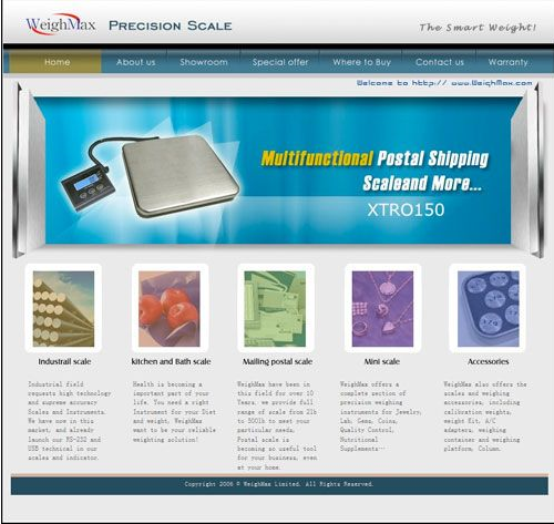
| design A |
Between design A and B, design A
is more appealing because the design of page is more aesthetic and minimalist
design. Furthermore, the concept of the page is more reliability and usability.
Then, both page is match between system and the real world because the system speak the user language, with word phrases and the concept familiar to the user but for design B, the font is not convenient for user to read it. As we can see, the graphic in design A is more attractive compared to design B because design A show the image that more real than image in design B.
2. If the page is unappealing,
what would you do to improve it?
 |
| design B |
We are going to change the design of the page to be more attractive. Call to action color which is find an accent or contrasting color for call to action button. Next, insert search navigation to help user find the information more easily and more faster.
3. Would you encourage others to visit this site ? Why or why not ?
I would like to encourage others to visit this site because it have the information about their product and users can compare their prices with other company or website. So, user can make the decision more easily and precise.
 |
| Current Design |
4. Then, compare these two designs with the latest web design of WeighMax. What do you think?
We think this current design is more modern than previous design because its contain the user account where user can sign up their account. Next, the design provide more information in neat way that can make user become more understood about the content in this website. User can make the decision based on the most popular product and the new arrival that appear in the page.


Comments
Post a Comment